Do you know which 2021-2027 Interreg programme areas cover your region?
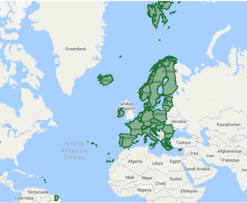
We have recently added all the 2021-2027 Interreg programmes mentioned in the Commission Implementing Decisions (EU) 2022/74 and (EU) 2022/75 to keep.eu. For the time being there is no financial or thematic information attached to the new programmes, but all the geographical areas mentioned in those decisions are loaded. Hence it is now possible to check which 2021-2027 Interreg programmes cover which country and which region, down to the smallest regional units (NUTS3).
To check the 2021-2027 Interreg programme areas receiving support from the ERDF and external financing instruments of the Union, go to keep.eu’s Programmes or its Countries and Regions areas.
Further information on the 2021-2027 programmes’ objectives, indicators etc. is foreseen to be added into keep.eu early in 2023, after all the programmes have been approved.